library(tidyverse)
library(wisclabmisc)
library(pROC, exclude = c("cov", "smooth", "var"))
#> Type 'citation("pROC")' for a citation.
A primer on ROC curves
wisclabmisc provides functions for tidying results from ROC curves. These curves arise in diagnostic or classification settings where we want to use some test score to determine whether an individual belongs in a control group versus a case group. This binary classification could be normal versus clinical status, regular email versus spam status, and so on. I use the terminology control and case to follow the pROC package’s interface.
In this classification literature, there are tons and tons of statistics to describe classifier performance. The ROC curve centers around the two important quantities of sensitivity and specificity:
-
sensitivity is the proportion of true cases
correctly identified as cases.
- Also called the true positive rate or recall.
- If I apply my spam classifier to 100 spam emails, how many will be correctly flagged as spam?
- P(case result | case status)
- Sensitivity makes sense to me if I think about the problem as detecting something subtle. (Like a Jedi being “force sensitive” or Spider-Man’s Spidey sense tingling when he’s in danger.)
-
specificity is the proportion of true controls
correctly identified as controls.
- Also called the true negative rate or selectivity.
- If I apply my spam classifier to 100 safe (ham) emails, how many will be correctly ignored?
- P(control result | control status)
- Specificity is not a great term; selectivity makes slightly more sense. We don’t want the sensor to trip over noise: It needs to be specific or selective.
Suppose our diagnostic instrument provides a score, and we have to choose a diagnostic threshold for one of these scores. For example, suppose we decide that scores above 60 indicate that an email is probably spam and can be moved into the spam folder. Then that threshold will have its own specificity attached to it. We can look at the proportion of spam emails that are equal to or above 60 (sensitivity), and we can look at the proportion of ham emails that are below 60 (specificity). Each number we choose for the threshold will have its own sensitivity and specificity score, so an ROC curve is a visualization of how sensitivity and specificity change along the range of threshold scores. (More impenetrable terminology: ROC stands for “receiver operating characteristic”, having something to do with detections made by radar receivers at different operating levels.)
A worked example
We can work through an example ROC curve using the pROC package. pROC
provides the aSAH dataset which provides “several clinical
and one laboratory variable of 113 patients with an aneurysmal
subarachnoid hemorrhage” (hence, aSAH).
We have the outcome (Good versus
Poor) and some measure called s100b. We can
see that that are many more Good outcomes near 0 and there
are Poor outcomes.
data <- as_tibble(aSAH)
data
#> # A tibble: 113 × 7
#>    gos6  outcome gender   age wfns  s100b  ndka
#>    <ord> <fct>   <fct>  <int> <ord> <dbl> <dbl>
#>  1 5     Good    Female    42 1      0.13  3.01
#>  2 5     Good    Female    37 1      0.14  8.54
#>  3 5     Good    Female    42 1      0.1   8.09
#>  4 5     Good    Female    27 1      0.04 10.4
#>  5 1     Poor    Female    42 3      0.13 17.4
#>  6 1     Poor    Male      48 2      0.1  12.8
#>  7 4     Good    Male      57 5      0.47  6
#>  8 1     Poor    Male      41 4      0.16 13.2
#>  9 5     Good    Female    49 1      0.18 15.5
#> 10 4     Good    Female    75 2      0.1   6.01
#> # ℹ 103 more rows
count(data, outcome)
#> # A tibble: 2 × 2
#>   outcome     n
#>   <fct>   <int>
#> 1 Good       72
#> 2 Poor       41

ggplot(data) +
  aes(x = s100b, y = outcome) +
  geom_point(
    position = position_jitter(width = 0, height = .2),
    size = 3,
    alpha = .2,
  ) +
  theme_grey(base_size = 12) +
  labs(y = NULL)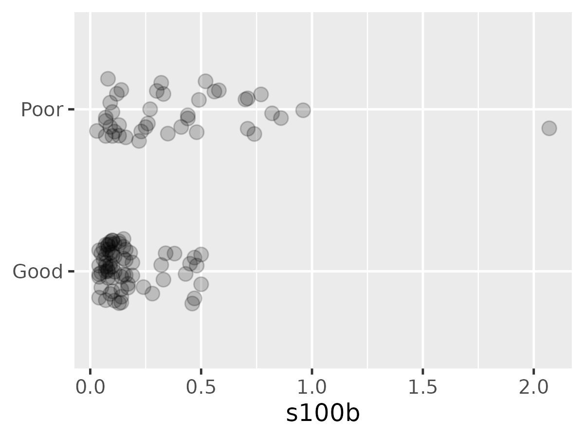
For each point in a grid of points along s100b, we can
compute the proportions of patients in each group above or below that
threshold. We can then plot these proportions to visualize the trading
relations between specificity and sensitivity as the threshold
changes.
by_outcome <- split(data, data$outcome)
smallest_diff <- min(diff(unique(sort(data$s100b))))
grid <- tibble(
  threshold = seq(
    min(data$s100b) - smallest_diff,
    max(data$s100b) + smallest_diff,
    length.out = 200
  )
)

roc_coordinates <- grid |>
  rowwise() |>
  summarise(
    threshold = threshold,
    prop_poor_above = mean(by_outcome$Poor$s100b >= threshold),
    prop_good_below = mean(by_outcome$Good$s100b < threshold),
  )

ggplot(roc_coordinates) +
  aes(x = threshold) +
  geom_step(aes(y = prop_poor_above)) +
  geom_step(aes(y = prop_good_below)) +
  annotate(
    "text", x = 2, y = .9, hjust = 1, vjust = 1, size = 3.25,
    label = "specificity\nproportion of `control` below threshold"
  ) +
  annotate(
    "text", x = 2, y = .1, hjust = 1, vjust = 0, size = 3.25,
    label = "sensitivity\nproportion of `clinical` above threshold"
  ) +
  labs(
    title = "Sensitivity and specificity as cumulative proportions",
    x = "threshold (diagnosis when score >= threshold)",
    y = NULL,
    subtitle = "threshold direction: control < clinical"
  )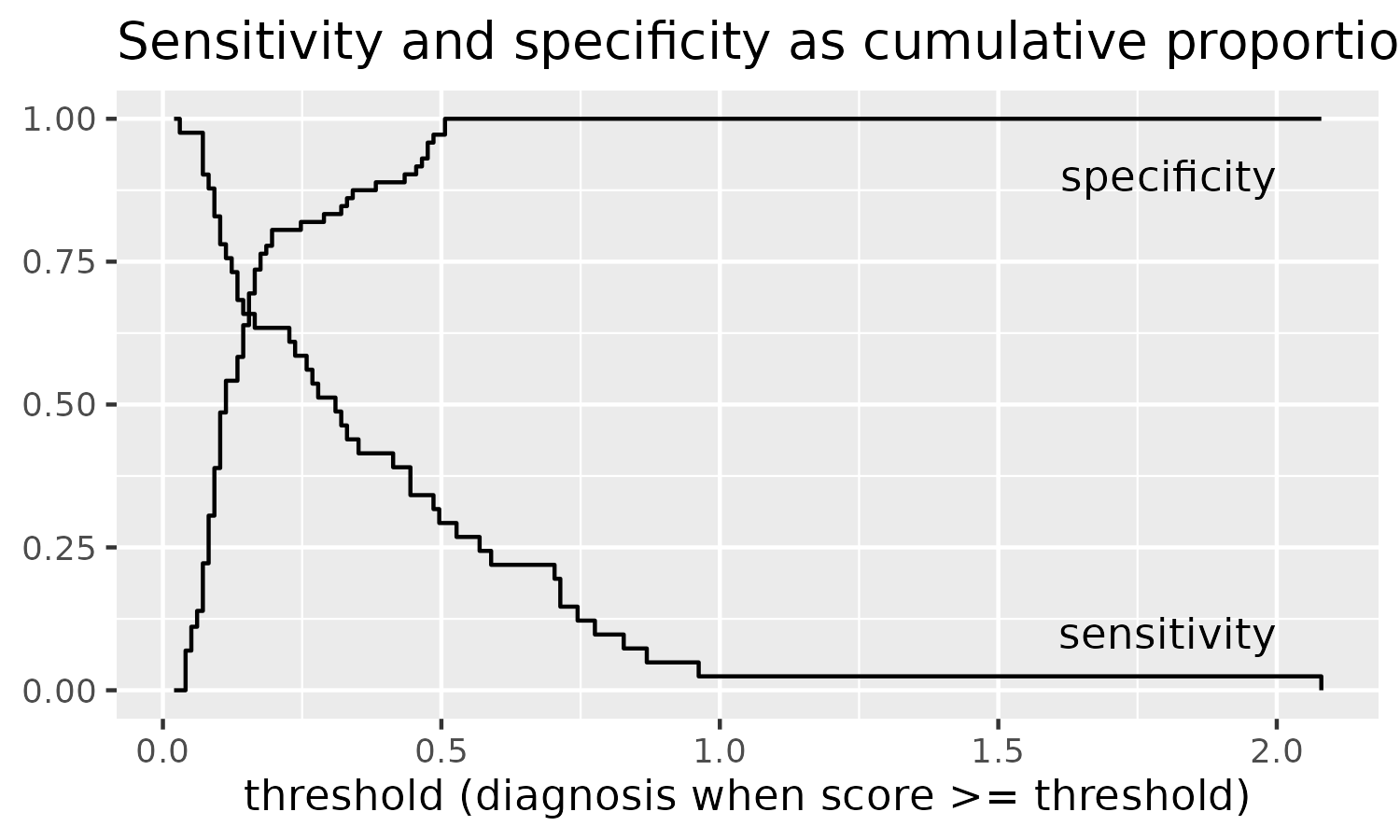
It took me about 5 tries to get this plot correct. I am able to
convince myself by noting that all of the Good outcomes are
less than .51 so the threshold should not catch a single
Good outcome above it and hence have specificity of 1.
Conversely, there is just one Poor outcome above 1, so a
threshold of 1 is going to detect one Poor outcome and
hence have a very low sensitivity.
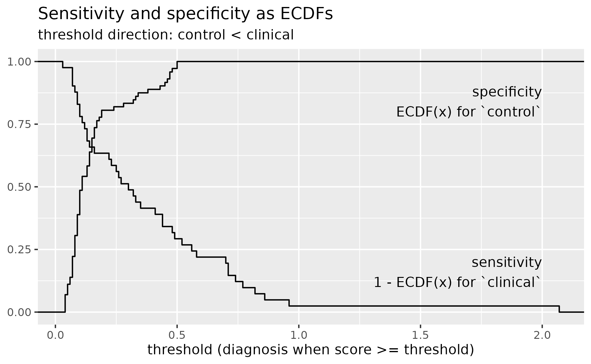
We can also compute the empirical sensitivity and specificity directly from the data instead of traversing a grid of thresholds by using the empirical cumulative distribution function (ECDFs). Cumulative distribution is the proportion of points below each value of x and empirical means that this value is computed directly from the data.
ggplot(data) +
  aes(x = s100b) +
  stat_ecdf(
    data = data |> filter(outcome == "Good"),
  ) +
  stat_ecdf(
    aes(y = 1 - after_stat(ecdf)),
    data = data |> filter(outcome == "Poor")
  ) +
  labs(
    x = "s100b",
    y = "Empirical distribution functions"
  ) +
  annotate(
    "text", x = 2, y = .9, hjust = 1, vjust = 1,
    label = "specificity\nECDF(x) for `control`"
  ) +
  annotate(
    "text", x = 2, y = .1, hjust = 1, vjust = 0,
    label = "sensitivity\n1 - ECDF(x) for `clinical`"
  ) +
  labs(
    title = "Sensitivity and specificity as ECDFs",
    x = "threshold (diagnosis when score >= threshold)",
    y = NULL,
    subtitle = "threshold direction: control < clinical"
  )
If we ignore the threshold values for our visualization, we can (finally) plot a canonical ROC curve. It shows specificity in reversing order so that the most ideal point is the top left corner (sensitivity = 1, specificity = 1).
roc_coordinates <- roc_coordinates |>
  rename(
    sensitivities = prop_poor_above,
    specificities = prop_good_below
  ) |>
  # otherwise the stair-steps look wrong
  arrange(sensitivities)

p <- ggplot(roc_coordinates) +
  aes(x = specificities, y = sensitivities) +
  geom_step() +
  scale_x_reverse() +
  coord_fixed() +
  theme_grey(base_size = 14)
p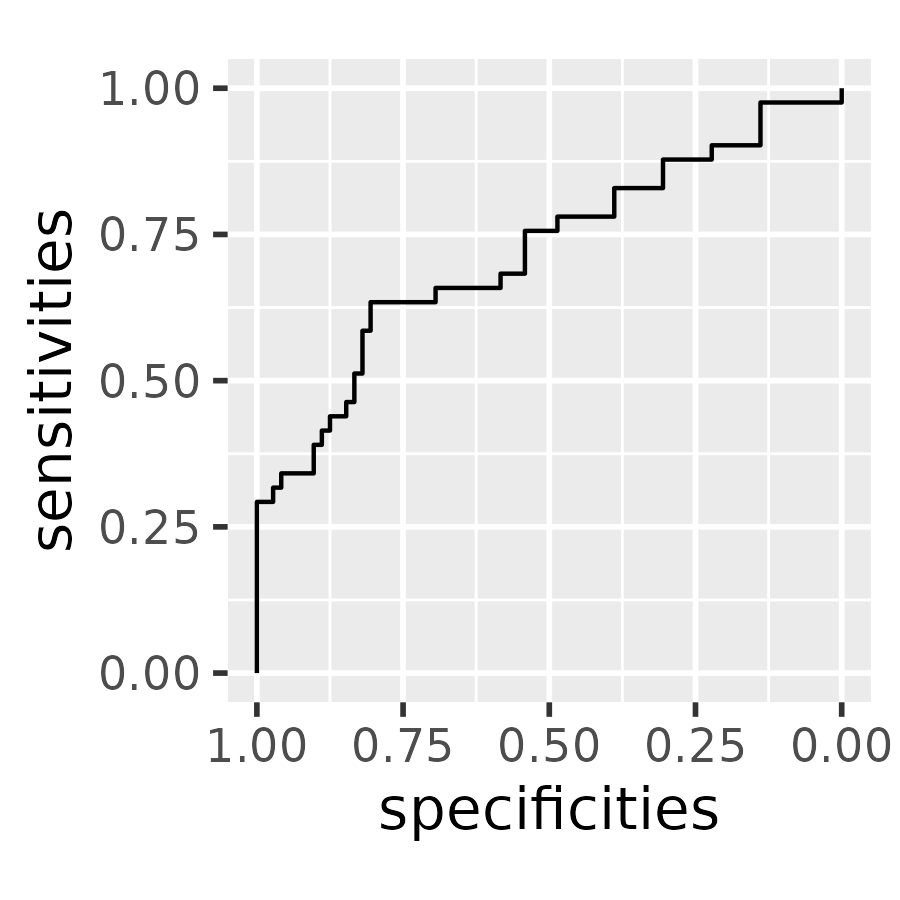
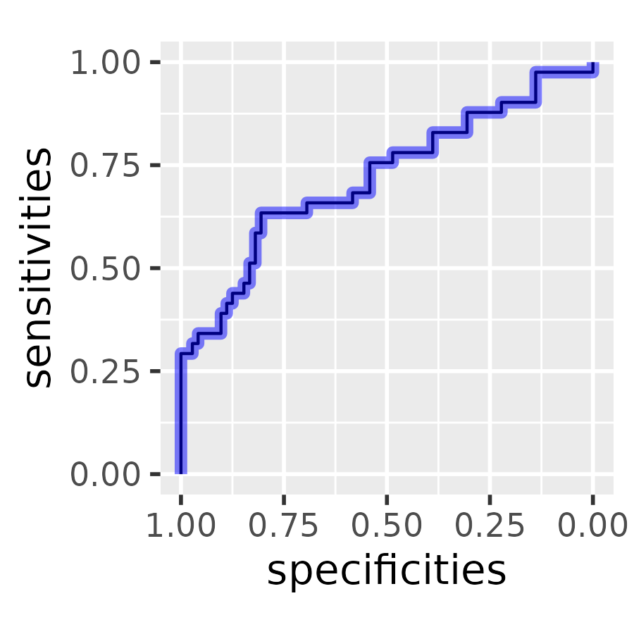
We can compare our plot to the one provided by pROC package. We find a perfect match in our sensitivity and specificity values.
roc <- pROC::roc(data, response = outcome, predictor = s100b)
#> Setting levels: control = Good, case = Poor
#> Setting direction: controls < cases
plot(roc)
proc_coordinates <- roc[2:3] |>
  as.data.frame() |>
  arrange(sensitivities)

# Plot the pROC point as a wide semi-transparent blue
# band on top of ours
p +
  geom_step(
    data = proc_coordinates,
    color = "blue",
    alpha = .5,
    linewidth = 2
  )
Instead of computing ROC curves by hand, we defer the calculation of ROC curves to the pROC package because it is easy to get confused when calculating sensitivity and specificity and because pROC provides other tools for working with ROC curves. Thus, wisclabmisc’s goal with ROC curves is to provide helper functions fit ROC curves with pROC and return the results in a nice dataframe.
We contrast two types of ROC curves:
- an empirical ROC curve where the raw data is used to make a jagged ROC curve
- a (smooth) density ROC curve where the densities of two distributions are used to make a smooth ROC curve.
Emprical ROC curves
Let’s return the above example, predicting the group label
outcome (case: Poor, control:
Good) from the predictor s100b.
r <- pROC::roc(data, outcome, s100b)
#> Setting levels: control = Good, case = Poor
#> Setting direction: controls < cases
r
#>
#> Call:
#> roc.data.frame(data = data, response = outcome, predictor = s100b)
#>
#> Data: s100b in 72 controls (outcome Good) < 41 cases (outcome Poor).
#> Area under the curve: 0.7314
From the messages, we can see that pROC::roc() makes a
few decisions for us: that Good is the control
level and Poor is the case level, and that
controls should have a lower s100b than cases.
pROC::roc() returns an roc object which
bundles all of the data and model results together. Ultimately, we want
a the results in a dataframe so that one row will provide the
sensitivity and specificity for each threshold value.
r
#>
#> Call:
#> roc.data.frame(data = data, response = outcome, predictor = s100b)
#>
#> Data: s100b in 72 controls (outcome Good) < 41 cases (outcome Poor).
#> Area under the curve: 0.7314
class(r)
#> [1] "roc"
str(r, max.level = 1, give.attr = FALSE)
#> List of 15
#>  $ percent           : logi FALSE
#>  $ sensitivities     : num [1:51] 1 0.976 0.976 0.976 0.976 ...
#>  $ specificities     : num [1:51] 0 0 0.0694 0.1111 0.1389 ...
#>  $ thresholds        : num [1:51] -Inf 0.035 0.045 0.055 0.065 ...
#>  $ direction         : chr "<"
#>  $ cases             : num [1:41] 0.13 0.1 0.16 0.12 0.44 0.71 0.49 0.07 0.33 0.09 ...
#>  $ controls          : num [1:72] 0.13 0.14 0.1 0.04 0.47 0.18 0.1 0.1 0.04 0.08 ...
#>  $ fun.sesp          :function (...)
#>  $ auc               : 'auc' num 0.731
#>  $ call              : language roc.data.frame(data = data, response = outcome, predictor = s100b)
#>  $ original.predictor: num [1:113] 0.13 0.14 0.1 0.04 0.13 0.1 0.47 0.16 0.18 0.1 ...
#>  $ original.response : Factor w/ 2 levels "Good","Poor": 1 1 1 1 2 2 1 2 1 1 ...
#>  $ predictor         : num [1:113] 0.13 0.14 0.1 0.04 0.13 0.1 0.47 0.16 0.18 0.1 ...
#>  $ response          : Factor w/ 2 levels "Good","Poor": 1 1 1 1 2 2 1 2 1 1 ...
#>  $ levels            : chr [1:2] "Good" "Poor"
We can get close to a dataframe by manipulating the list or by using
coords(). pROC::coords() has additional
features that allow it to identify the “best” ROC points, but it strips
off useful data like the direction used.
r[1:5] |>
  as.data.frame() |>
  tibble::as_tibble()
#> # A tibble: 51 × 5
#>    percent sensitivities specificities thresholds direction
#>    <lgl>           <dbl>         <dbl>      <dbl> <chr>
#>  1 FALSE           1            0        -Inf     <
#>  2 FALSE           0.976        0           0.035 <
#>  3 FALSE           0.976        0.0694      0.045 <
#>  4 FALSE           0.976        0.111       0.055 <
#>  5 FALSE           0.976        0.139       0.065 <
#>  6 FALSE           0.902        0.222       0.075 <
#>  7 FALSE           0.878        0.306       0.085 <
#>  8 FALSE           0.829        0.389       0.095 <
#>  9 FALSE           0.780        0.486       0.105 <
#> 10 FALSE           0.756        0.542       0.115 <
#> # ℹ 41 more rows

pROC::coords(r) |>
  tibble::as_tibble()
#> # A tibble: 51 × 3
#>    threshold specificity sensitivity
#>        <dbl>       <dbl>       <dbl>
#>  1  -Inf          0            1
#>  2     0.035      0            0.976
#>  3     0.045      0.0694       0.976
#>  4     0.055      0.111        0.976
#>  5     0.065      0.139        0.976
#>  6     0.075      0.222        0.902
#>  7     0.085      0.306        0.878
#>  8     0.095      0.389        0.829
#>  9     0.105      0.486        0.780
#> 10     0.115      0.542        0.756
#> # ℹ 41 more rows
wisclabmisc provides compute_empirical_roc() which
combines results from pROC::roc() and
pROC::coords() into a tibble. It includes metadata about
the .controls and .cases levels, the
.direction of the relationship, and the overall
.auc of the curve. It also identifies two “best”
coordinates with .is_best_youden and
is_best_closest_topleft. Finally, it retains the name of
the predictor variable.
compute_empirical_roc(data, outcome, s100b)
#> ℹ No `levels` provided. Using `levels = c("Good", "Poor")`.
#> • Setting control to outcome == "Good".
#> • Setting case to outcome == "Poor".
#> Setting direction: controls < cases
We can still see the messages emitted by the pROC::roc()
call when we use compute_empirical_roc(). We can pass the
arguments direction and levels to
pROC::roc() to silence these messages.
data_roc <- compute_empirical_roc(
  data,
  outcome,
  s100b,
  direction = "<",
  levels = c("Good", "Poor")
)
data_roc
#> # A tibble: 51 × 11
#>       s100b .specificities .sensitivities  .auc .direction .controls .cases
#>       <dbl>          <dbl>          <dbl> <dbl> <chr>      <chr>     <chr>
#>  1 -Inf             0               1     0.731 <          Good      Poor
#>  2    0.035         0               0.976 0.731 <          Good      Poor
#>  3    0.045         0.0694          0.976 0.731 <          Good      Poor
#>  4    0.055         0.111           0.976 0.731 <          Good      Poor
#>  5    0.065         0.139           0.976 0.731 <          Good      Poor
#>  6    0.075         0.222           0.902 0.731 <          Good      Poor
#>  7    0.085         0.306           0.878 0.731 <          Good      Poor
#>  8    0.095         0.389           0.829 0.731 <          Good      Poor
#>  9    0.105         0.486           0.780 0.731 <          Good      Poor
#> 10    0.115         0.542           0.756 0.731 <          Good      Poor
#> # ℹ 41 more rows
#> # ℹ 4 more variables: .n_controls <int>, .n_cases <int>, .is_best_youden <lgl>,
#> #   .is_best_closest_topleft <lgl>
According to the help page for pROC::coords() is
Youden’s J statistic is the point that is farthest vertical distance
from the diagonal line. The other “best” point is the point closest to
the upper-left corner. The following plot labels each of these
distances. The Youden’s point and the topleft point here are the same
point.
data_roc <- data_roc |>
  arrange(.sensitivities)

p_best <- ggplot(data_roc) +
  aes(x = .specificities, y = .sensitivities) +
  geom_abline(
    slope = 1,
    intercept = 1,
    linetype = "dotted",
    color = "grey20"
  ) +
  geom_step() +
  geom_segment(
    aes(xend = .specificities, yend = 1 - .specificities),
    data = function(x) filter(x, .is_best_youden),
    color = "blue",
    linetype = "dashed"
  ) +
  geom_segment(
    aes(xend = 1, yend = 1),
    data = function(x) filter(x, .is_best_closest_topleft),
    color = "maroon",
    linetype = "dashed"
  ) +
  # Basically, finding a point 9/10ths of the way
  # along the line
  geom_text(
    aes(
      x = weighted.mean(c(1, .specificities), c(9, 1)),
      y = weighted.mean(c(1, .sensitivities), c(9, 1)),
    ),
    data =  function(x) filter(x, .is_best_closest_topleft),
    color = "maroon",
    label = "closest to topleft",
    hjust = 0,
    nudge_x = .02,
    size = 5
  ) +
  geom_text(
    aes(
      x = .specificities,
      y = weighted.mean(c(1 - .specificities, .sensitivities), c(1, 2)),
    ),
    data =  function(x) filter(x, .is_best_youden),
    color = "blue",
    label = "Youden's J\n(max height above diagonal)",
    hjust = 0,
    vjust = .5,
    nudge_x = .02,
    size = 5
  ) +
  annotate(
    "text",
    x = .91,
    y = .05,
    hjust = 0,
    size = 5,
    label = "diagonal: random classifier",
    color = "grey20"
  ) +
  scale_x_reverse() +
  coord_fixed() +
  theme_grey(base_size = 12)
p_best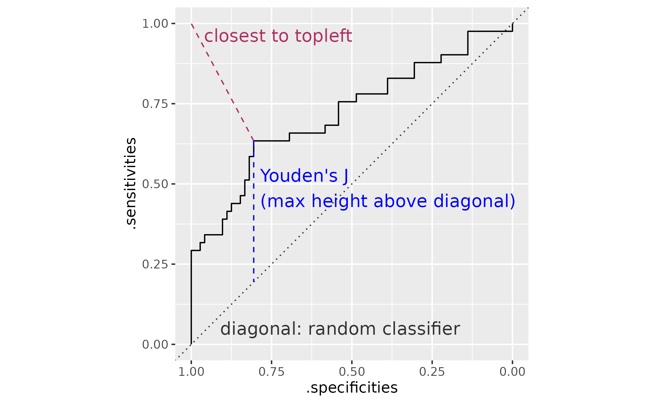
Empirical ROC curves on weighted data
pROC::roc() does not support observation weights, so
this package provides compute_sens_spec_from_ecdf() to
compute sensitivity and specificity using (weighted) ECDFs. If not
weights are provided, the normal unweighted results are used. This
function does not use pROC::roc() at all.
To simulate weighting, we will round the existing predictor and count the number of observations in each bin (rounded value). That count is the weight.
data_bin <- data |>
  mutate(s100b_bin = round(s100b, 1)) |>
  group_by(outcome, s100b_bin) |>
  summarise(
    n = n(),
    .groups = "drop"
  )

data_sens_spec <- compute_sens_spec_from_ecdf(
  data_bin,
  response = outcome,
  predictor = s100b_bin,
  weights = n,
  direction = "case-high",
  levels = c("Good", "Poor")
)
For comparison, use the pROC-based approach on the rounded data. Here we have the manually computed ROC-curve on weighted data in black and the pROC-computed ROC data on unweighted data.
data_sens_spec2 <- data |>
  mutate(s100b_bin = round(s100b, 1)) |>
  compute_empirical_roc(
    response = outcome,
    predictor = s100b_bin,
    direction = "case-high",
    levels = c("Good", "Poor")
  )

ggplot(data_sens_spec) +
  aes(x = .specificities, y = .sensitivities) +
  geom_step(
    direction = "vh",
    data = data_sens_spec2,
    color= "orange",
    alpha = .5,
    linewidth = 2
  ) +
  geom_step(direction = "vh") +
  scale_x_reverse()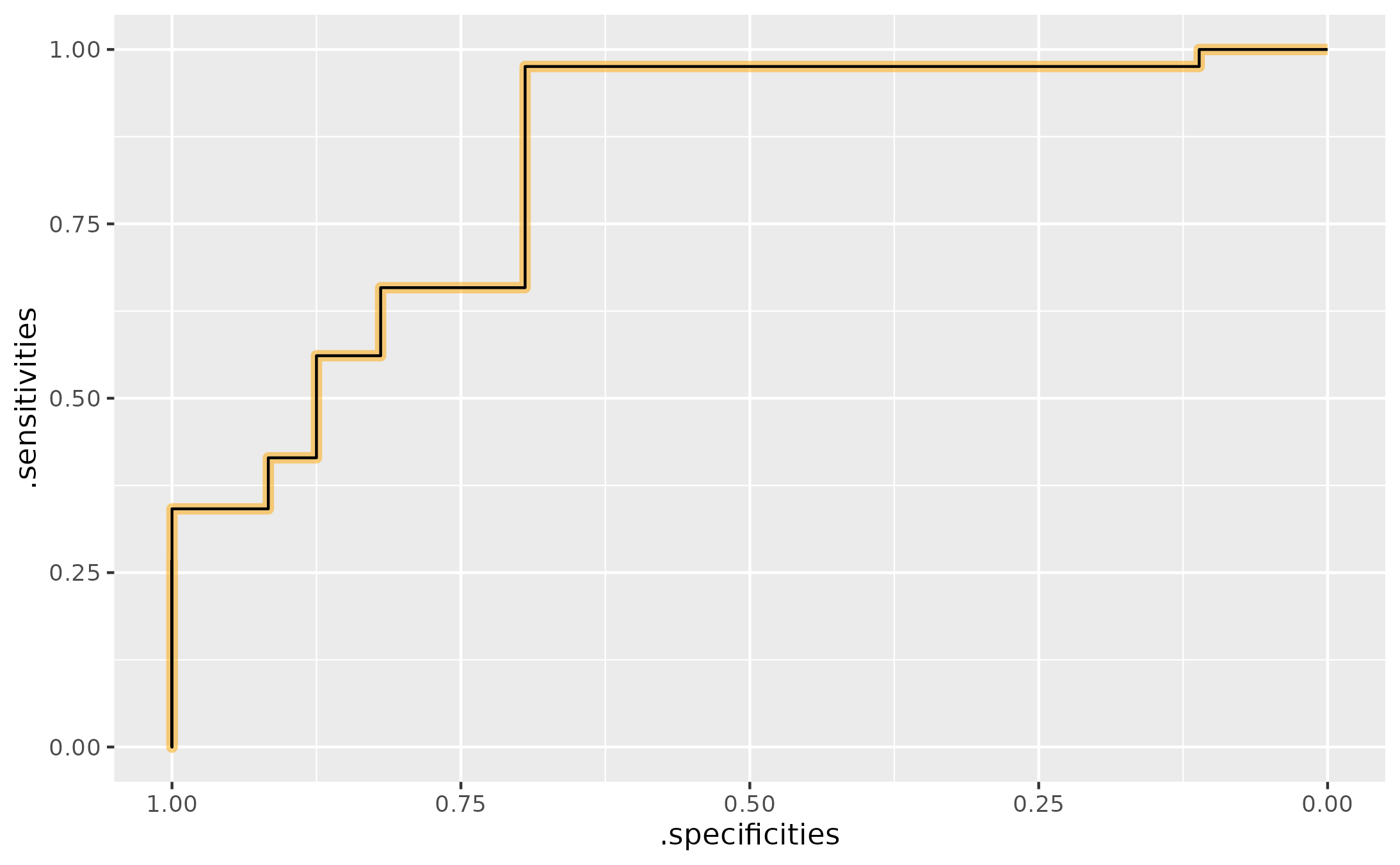
(Smooth) density ROC curves
Instead of looking at the observed data, let’s assume the
s100b values in each group are drawn from a normal
distribution but the means and scales (standard deviations) are
different for the two groups. We can compute each group’s mean and
standard deviation and then plot the normal density curves on top of
each other. Pepe (2003) refers to this approach as the “binormal ROC
curve”.
data_stats <- data |>
  group_by(outcome) |>
  summarise(
    mean = mean(s100b),
    sd = sd(s100b)
  )

l_control <- data_stats |>
  filter(outcome == "Good") |>
  as.list()

l_case <- data_stats |>
  filter(outcome != "Good") |>
  as.list()

ggplot(data) +
  aes(x = s100b, color = outcome) +
  # include a "rug" at the bottom
  geom_jitter(aes(y = -.2), width = 0, height = .15, alpha = .4) +
  stat_function(
    data = function(x) filter(x, outcome == "Good"),
    fun = dnorm,
    args = list(mean = l_control$mean, sd = l_control$sd)
  ) +
  stat_function(
    data = function(x)filter(x, outcome != "Good"),
    fun = dnorm,
    args = list(mean = l_case$mean, sd = l_case$sd)
  ) +
  geom_text(
    aes(x = mean, y = dnorm(mean, mean, sd), label = outcome),
    data = data_stats,
    vjust = "inward",
    hjust = 0,
    nudge_x = .05,
    nudge_y = .05,
    size = 4
  ) +
  theme_grey(14) +
  theme(legend.position = "top", legend.justification = "left") +
  labs(y = NULL) +
  guides(color = "none")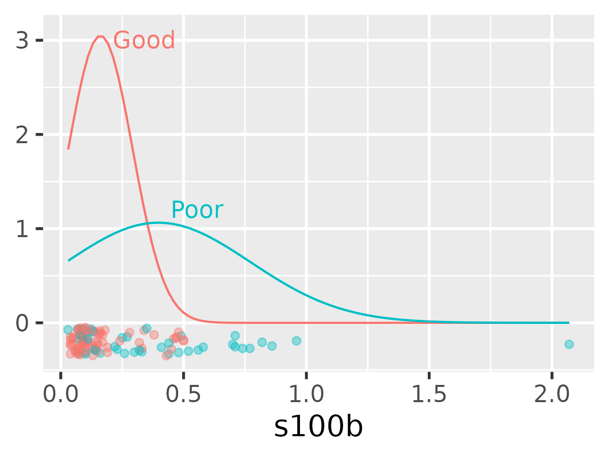
At various points along the x-axis range,
stat_function() compute dnorm() (the density
of the normal curves). We can do that by hand too. We take the full
range of the data, and then within each group, generate a set of points
along that range and compute that group’s density at each point.
data_grid <- data |>
  mutate(
    xmin = min(s100b),
    xmax = max(s100b)
  ) |>
  group_by(outcome) |>
  reframe(
    x = seq(xmin[1], xmax[1], length.out = 200),
    group_mean = mean(s100b),
    group_sd = sd(s100b),
    density = dnorm(x, group_mean, group_sd),
    .groups = "drop"
  )
data_grid
#> # A tibble: 400 × 6
#>    outcome      x group_mean group_sd density .groups
#>    <fct>    <dbl>      <dbl>    <dbl>   <dbl> <chr>
#>  1 Good    0.03        0.162    0.131    1.84 drop
#>  2 Good    0.0403      0.162    0.131    1.98 drop
#>  3 Good    0.0505      0.162    0.131    2.13 drop
#>  4 Good    0.0608      0.162    0.131    2.27 drop
#>  5 Good    0.0710      0.162    0.131    2.40 drop
#>  6 Good    0.0813      0.162    0.131    2.53 drop
#>  7 Good    0.0915      0.162    0.131    2.64 drop
#>  8 Good    0.102       0.162    0.131    2.75 drop
#>  9 Good    0.112       0.162    0.131    2.84 drop
#> 10 Good    0.122       0.162    0.131    2.91 drop
#> # ℹ 390 more rows
Next, we pivot to a wide pivot format because we will be comparing the two densities at each point.
data_dens <- data_grid |>
  rename(s100b = x) |>
  select(-group_mean, -group_sd) |>
  pivot_wider(names_from = outcome, values_from = density)
data_dens
#> # A tibble: 200 × 4
#>     s100b .groups  Good  Poor
#>     <dbl> <chr>   <dbl> <dbl>
#>  1 0.03   drop     1.84 0.659
#>  2 0.0403 drop     1.98 0.676
#>  3 0.0505 drop     2.13 0.694
#>  4 0.0608 drop     2.27 0.711
#>  5 0.0710 drop     2.40 0.729
#>  6 0.0813 drop     2.53 0.746
#>  7 0.0915 drop     2.64 0.763
#>  8 0.102  drop     2.75 0.780
#>  9 0.112  drop     2.84 0.797
#> 10 0.122  drop     2.91 0.813
#> # ℹ 190 more rows
pROC::roc() can compute an ROC curve from these
densities. Note that the interface here is different. We do not provide
a dataframe and names of columns in that data frame. Instead, we provide
two vectors of densities, and in fact, those densities are lost after
computing the ROC curve.
data_dens <- arrange(data_dens, s100b)
r_dens <- roc(
  density.controls = data_dens$Good,
  density.cases = data_dens$Poor
)
r_dens
#>
#> Call:
#> roc.default(density.controls = data_dens$Good, density.cases = data_dens$Poor)
#>
#> Data: (unknown) in 0 controls ((unknown) )  0 cases ((unknown) ).
#> Smoothing: density with controls: data_dens$Good; and cases: data_dens$Poor
#> Area under the curve: 0.8299
plot(r_dens)
The roc object here returns the coordinates with
sensitivity in decreasing order, so it is not obvious how to map these
sensitivities back to the original densities. In terms of the earlier
density plot, we don’t know whether the sensitivities move up the
x axis or down the x axis.
Let’s restate the problem again, for clarity:
- We want to map thresholds to densities to ROC coordinates and map ROC coordinates back to densities to thresholds.
- With
pROC::roc(density.controls, density.controls), we hit a brick wall and cannot map backwards from ROC coordinates because the sensitivites may have been reversed with respect to the densities.
Fortunately, if we compute the sensitivities by hand, we can figure
out how the coordinates were ordered. We try both orderings and find the
one that best matches one provided by pROC::roc().
# direction > : Good > threshold >= Poor
sens_gt <- rev(cumsum(data_dens$Poor) / sum(data_dens$Poor))
# direction < : Good < threshold <= Poor
sens_lt <- 1 - (cumsum(data_dens$Poor) / sum(data_dens$Poor))
# The model did ??
fitted_sensitivities <- r_dens$sensitivities[-c(1, 201)]

mean(fitted_sensitivities - sens_lt)
#> [1] 0.004999997
mean(fitted_sensitivities - sens_gt)
#> [1] -0.530585
Because the < direction better matched the ROC
results, we conclude that the sensitivities follow the same order as the
densities.
compute_smooth_density_roc() uses a similar heuristic to
determine the order of the ROC coordinates with respect to the original
densities. As a result, we can map the original threshold values to
sensitivity and specificity values. The function also lets us use column
names directly.
data_smooth <- compute_smooth_density_roc(
  data = data_dens,
  controls = Good,
  cases = Poor,
  along = s100b
)
data_smooth
#> # A tibble: 202 × 11
#>     s100b .groups  Good  Poor .sensitivities .specificities  .auc .roc_row
#>     <dbl> <chr>   <dbl> <dbl>          <dbl>          <dbl> <dbl>    <int>
#>  1 0.03   drop     1.84 0.659          1             0      0.830        2
#>  2 0.0403 drop     1.98 0.676          0.992         0.0221 0.830        3
#>  3 0.0505 drop     2.13 0.694          0.984         0.0460 0.830        4
#>  4 0.0608 drop     2.27 0.711          0.975         0.0716 0.830        5
#>  5 0.0710 drop     2.40 0.729          0.967         0.0989 0.830        6
#>  6 0.0813 drop     2.53 0.746          0.958         0.128  0.830        7
#>  7 0.0915 drop     2.64 0.763          0.949         0.158  0.830        8
#>  8 0.102  drop     2.75 0.780          0.939         0.190  0.830        9
#>  9 0.112  drop     2.84 0.797          0.930         0.223  0.830       10
#> 10 0.122  drop     2.91 0.813          0.920         0.257  0.830       11
#> # ℹ 192 more rows
#> # ℹ 3 more variables: .direction <chr>, .is_best_youden <lgl>,
#> #   .is_best_closest_topleft <lgl>
compute_smooth_density_roc() also provides coordinates
for the “best” thresholds by the Youden or topleft criteria. Because of
the consistency between the two functions, we can just replace the data
used to make annotated ROC curve with the smoothed ROC coordinates. In
this case, the Youden and topleft points are different.
p_best + list(data_smooth)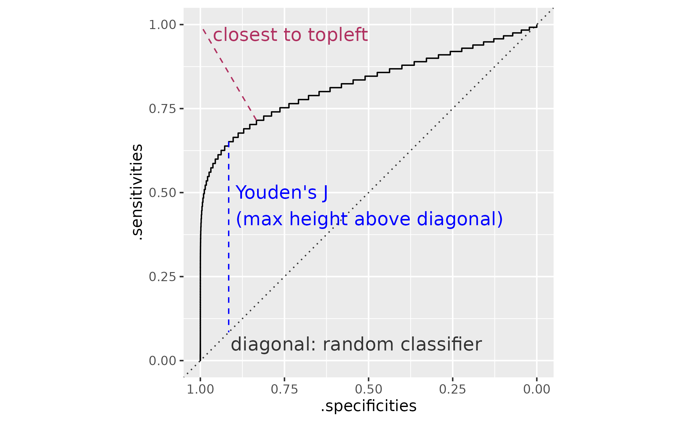
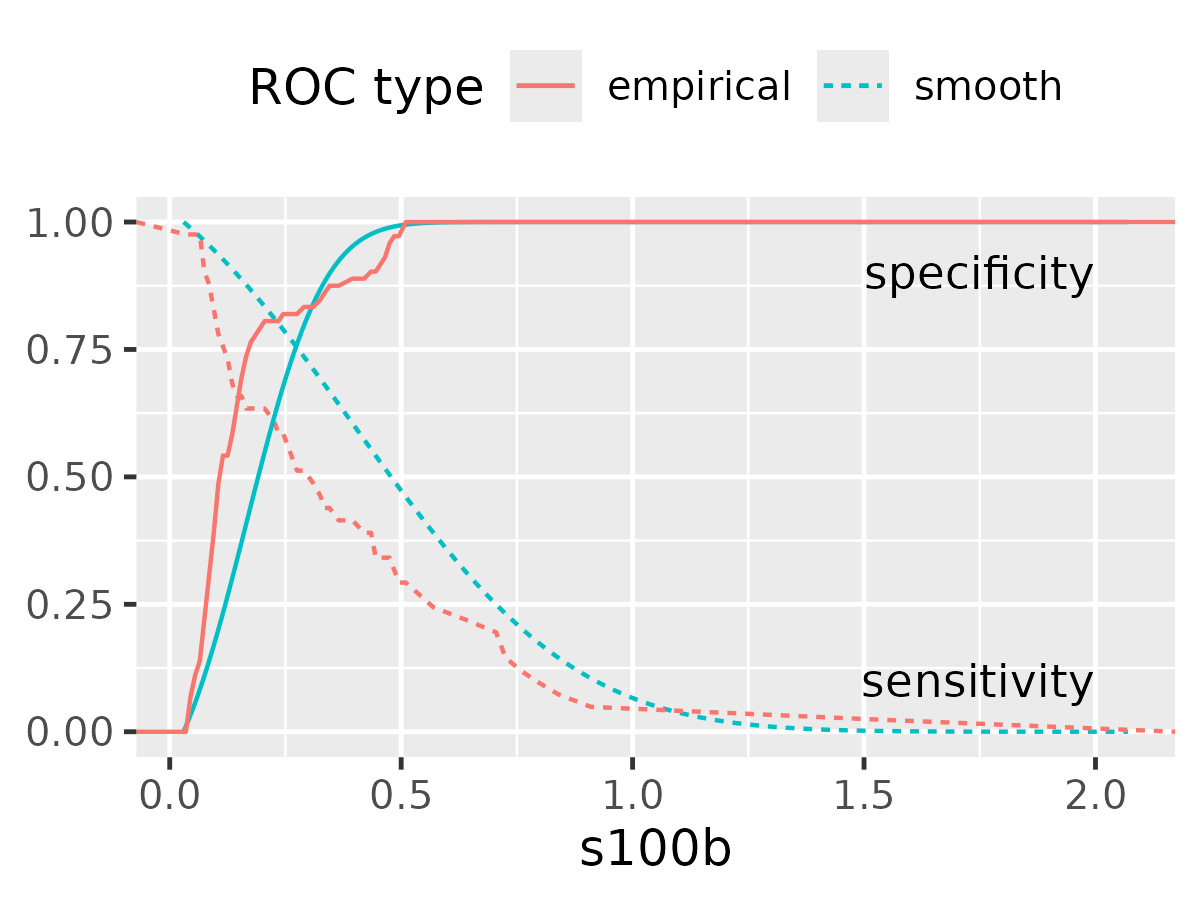
As a final demonstration, let’s compare the smooth and empirical ROC sensitivity and specificity values along the threshold values.
ggplot(data_smooth) +
  aes(x = s100b) +
  geom_line(
    aes(color = "smooth", linetype = "smooth", y = .sensitivities),
  ) +
  geom_line(
    aes(color = "empirical", linetype = "smooth", y = .sensitivities),
    data = data_roc
  ) +
  geom_line(
    aes(color = "smooth", linetype = "empirical", y = .specificities)
  ) +
  geom_line(
    aes(color = "empirical", linetype = "empirical", y = .specificities),
    data = data_roc
  ) +
  annotate("text", x = 2, y = .9, hjust = 1, label = "specificity") +
  annotate("text", x = 2, y = .1, hjust = 1, label = "sensitivity") +
  labs(
    color = "ROC type",
    linetype = "ROC type",
    y = NULL
  ) +
  theme_grey(base_size = 12) +
  theme(legend.position = "top")
#> Warning: Removed 2 rows containing missing values or values outside the scale range
#> (`geom_line()`).
#> Removed 2 rows containing missing values or values outside the scale range
#> (`geom_line()`).