Darren Dahly, username @statsepi, asked people on Twitter to share some of their favorite or least favorite data visualizations from the pandemic. I nominated the notorious “cubic fit” ‘forecast’ from the Council of Economic Advisers. But then there was the reply by Travis Whitfill, username @twhitfill, showing a nightmare of a figure from a report produced by Morgan Stanley:
I’d like to submit this one from Morgan Stanley 🤦🏻♂️ pic.twitter.com/D5CYi6zSrT
— Travis Whitfill MPH (@twhitfill) March 21, 2022
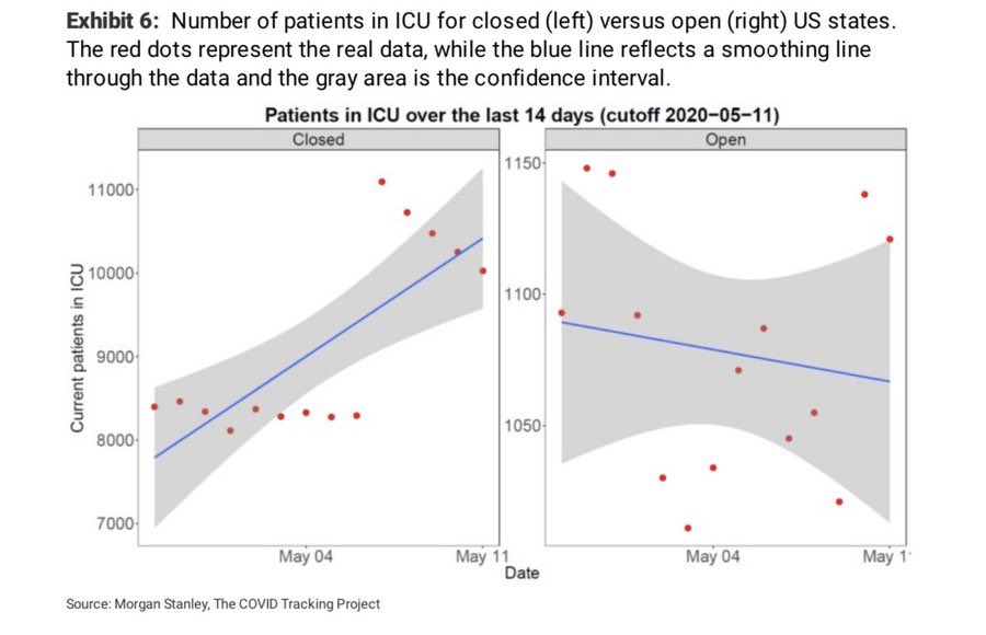
The main statistical problem here is the completely inappropriate “smoothing” line. The panel on the left is really two linear trends: a steady trend around 8,500 patients until May 6th and a decreasing trend from 11,000 patients starting on May 7th. Upon seeing data like these points, I would be inclined to ask, “What changed in the data? Was a new state added to the dataset? Did the definition of what counts as an ICU bed change?” The analysts here instead imposed a linear trend on the points.
Another problem with this plot is rhetorical: it’s tryhard
counterintuitive bullshit. I think analysts will fetishize surprising or
counterintuitive findings, with an attitude of “oh, you would think that
such-and-such is true but the data show us that actually the opposite
is true”. At the time of this plot, our belief was something like
“Covid-19 protections like stay-at-home orders can help flatten the curve
and reduce the spread of the disease and the number of
hospitalizations.” This plot sashays into the room and tells us “well,
according to the data, it’s the states without Covid-19 protections that have
decreasing numbers of ICU patients, and get this: Covid lockdowns make things
worse!”. Granted, I could not find the original report for this
image, so I don’t know how the authors interpreted it in the report’s
narrative. Yet, I can only assume the authors added these linear trend
lines–overriding the default GAM or LOESS smooth used by
stat_smooth()–to make this particular point.
When I first saw it, this plot made me quip: “I hate statistics now. it’s been a good run. gonna live my days out as a druid”. But it’s been a few days, and I’m still haunted by this plot. What did go wrong? Why do the ICU counts shoot upwards like that? So, I investigated it.
Attempt 1: There is no jump
I tried to find the original report, searching Google and Twitter for a report with this image from around May 12, 2020 (when @twhitfill first shared it), but nothing came up. After dredging through a bunch of Morgan Stanley report PDFs, I noticed that the reports usually had a small number of authors, so I am wondering whether (and hoping that) the original report was something more akin to a dashed-off newsletter than a research report.
Failing to find the original image, I tried to recreate it in R. The original image credits The COVID Tracking Project, and their downloads page provides a .csv file with state-level data. Here we read in just the relevant columns, filter down to the time range of the cursed image, and plot the total number of current ICU patients.
library(tidyverse)

# a helper function to download the data from github
# in case you want to play along
path_blog_data <- function(x) {
  file.path(
    "https://raw.githubusercontent.com",
    "tjmahr/tjmahr.github.io/master/_R/data",
    x
  )
}

data <- readr::read_csv(
  path_blog_data("all-states-history.csv"),
  col_types = cols(
    date = col_date(),
    state = col_character(),
    inIcuCurrently = col_number(),
    .default = col_skip()
  ),
  progress = FALSE
)

data <- data %>%
  filter(
    as.Date("2020-04-28") <= date,
    date <= as.Date("2020-05-11")
  )

ggplot(data) +
  aes(x = date, y = inIcuCurrently) +
  stat_summary(fun = "sum", geom = "point", size = 3) +
  labs(
    x = "Date",
    y = "Current patients in ICU",
    caption = "Data from The COVID Project (March 23, 2022)"
  ) +
  theme_grey(base_size = 16)
#> Warning: Removed 454 rows containing non-finite values (stat_summary).
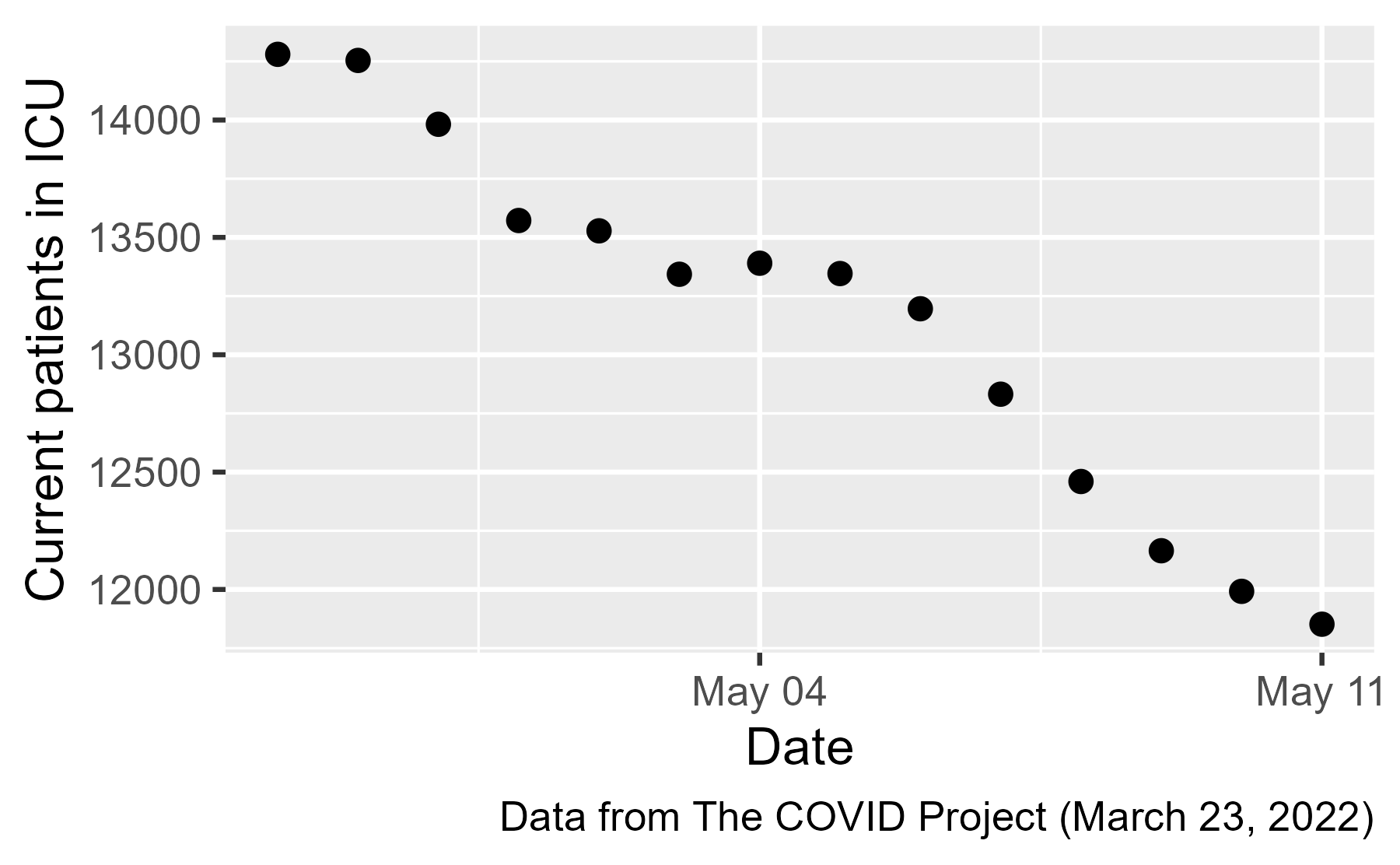
There is no jump in ICU patients ❌, and because the jump disappeared when we used a more recent (and presumably better) version of the dataset, the jump was probably some kind of artifact.
Out of curiosity, let’s look at the state-by-state data. Because
(spoiler alert) about half the states only have NA values for this
time period, we will filter out the NA points and look at the
remaining points.
ggplot(data %>% filter(!is.na(inIcuCurrently))) +
  aes(x = date, y = inIcuCurrently) +
  geom_point() +
  facet_wrap("state") +
  labs(
    x = "Date",
    y = "Current patients in ICU",
    caption = "Data from The COVID Project (March 23, 2022)"
  ) +
  theme_grey(base_size = 12)
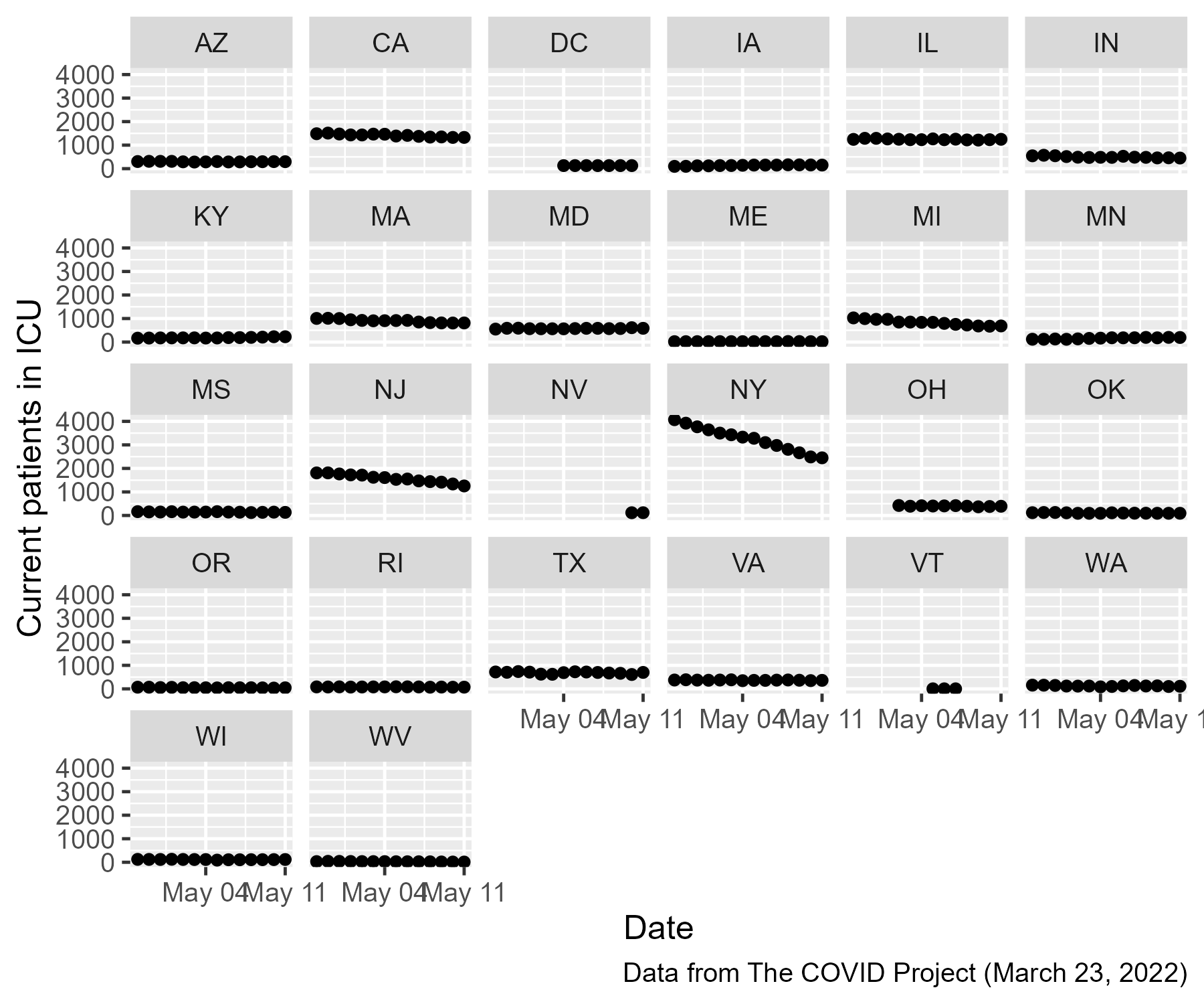
So, some states have ICU patient data added midway through this window and many states are completely missing data from this window. The whole open-versus-closed-states question was doomed from the get-go because we don’t know what happened in every state.
Attempt 2: Let’s go back in time
If we poke around the COVID Tracking Project’s GitHub repository, we
find a folder of data
backups
with a file called states_daily_4pm_et.csv. This file provides the
same result as the previously loaded data.
data <- readr::read_csv(
  path_blog_data("states_daily_4pm_et.csv"),
  col_types = cols(
    date = col_date("%Y%m%d"),
    state = col_character(),
    inIcuCurrently = col_number(),
    .default = col_skip()
  ),
  progress = FALSE
)

data <- data %>%
  filter(
    as.Date("2020-04-28") <= date,
    date <= as.Date("2020-05-11")
  )

ggplot(data) +
  aes(x = date, y = inIcuCurrently) +
  stat_summary(fun = "sum", geom = "point", size = 3) +
  labs(
    x = "Date",
    y = "Current patients in ICU",
    caption = "Data from The COVID Project (March 23, 2022)"
  ) +
  theme_grey(base_size = 16)
#> Warning: Removed 454 rows containing non-finite values (stat_summary).

But because this file is hosted on GitHub, we can go back in time and find the version of the data from May 12, 2020 and use that file instead.
data <- readr::read_csv(
  path_blog_data("2020-05-12-states_daily_4pm_et.csv"),
  col_types = cols(
    date = col_date("%Y%m%d"),
    state = col_character(),
    inIcuCurrently = col_number(),
    .default = col_skip()
  ),
  progress = FALSE
)

data <- data %>%
  filter(
    as.Date("2020-04-28") <= date,
    date <= as.Date("2020-05-11")
  )

ggplot(data) +
  aes(x = date, y = inIcuCurrently) +
  stat_summary(fun = "sum", geom = "point", size = 3) +
  labs(
    x = "Date",
    y = "Current patients in ICU",
    caption = "Data from The COVID19 Project (May 12, 2020)"
  ) +
  theme_grey(base_size = 16)
#> Warning: Removed 477 rows containing non-finite values (stat_summary).
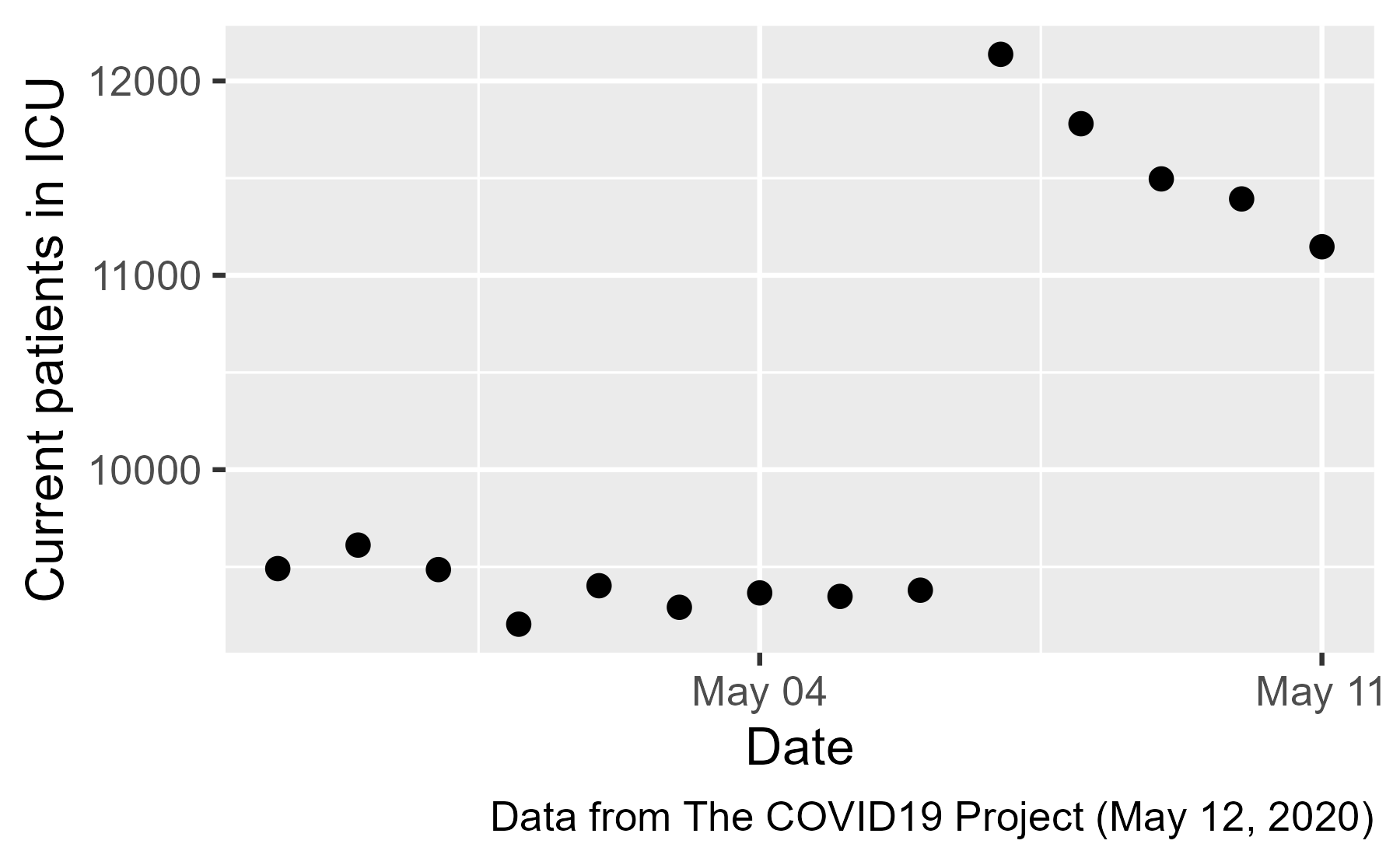
There it is: the jump ICU patients on May 7th ✔️. Let’s look at the state-by-state data:
ggplot(data %>% filter(!is.na(inIcuCurrently))) +
  aes(x = date, y = inIcuCurrently) +
  geom_point() +
  facet_wrap("state") +
  labs(
    x = "Date",
    y = "Current patients in ICU",
    caption = "Data from The COVID Project (May 12, 2020)"
  ) +
  theme_grey(base_size = 12)
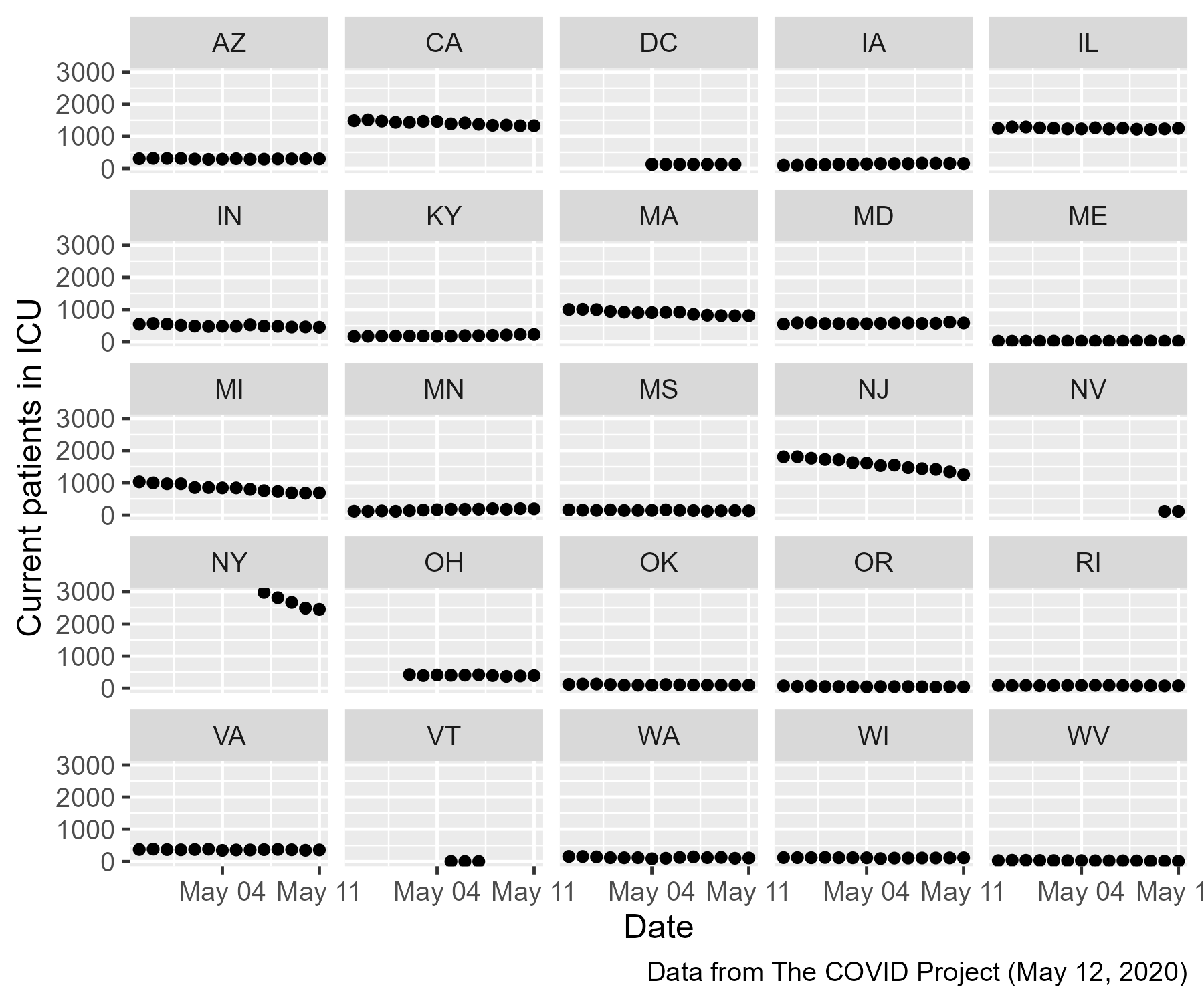
Look at New York (NY)! That’s the jump in original plot. New York had a large number of ICU patients but their data only became available on May 7th, giving the spurious increase in ICU patients.
By adding incomplete data from NY to the rest of the states, the analyst effectively treated all of the missing points in the NY panel as zeros.
What could they have done differently?
It’s fun to complain about haunted plots, but I will try to be constructive for a moment. How would a fixed version of this plot look?
Option 1: Don’t do it. Given all the missing and incomplete data, it’s just not worth it to make this plot.
Option 2: Don’t aggregate. Or we might embrace the missingness, and show all and only the data we have. Here is a sketch of this kind of approach. We will show individual state data and provide labels for the states that stand out from the pack. We will also note the number of missing lines in the caption.
data_for_plot <- data %>%
  filter(!is.na(inIcuCurrently)) %>%
  group_by(state) %>%
  mutate(state_icu_max = max(inIcuCurrently)) %>%
  ungroup()

total_regions <- data$state %>% unique() %>% length()
plotted_regions <- data_for_plot$state %>% unique() %>% length()

ggplot(data_for_plot) +
  aes(x = date, y = inIcuCurrently) +
  geomtextpath::geom_textline(
    aes(label = state, group = state, hjust = state),
    data = . %>% filter(state_icu_max > 250)
  ) +
  geomtextpath::scale_hjust_discrete() +
  geom_line(
    aes(group = state),
    data = . %>% filter(state_icu_max <= 250)) +
  labs(
    x = "Date",
    y = "Current patients in ICU",
    caption = glue::glue(
      "
      Data from The COVID Project (May 12, 2020).
      No data available for {total_regions - plotted_regions} states/territories.
      "
    )
  ) +
  theme_grey(base_size = 14)
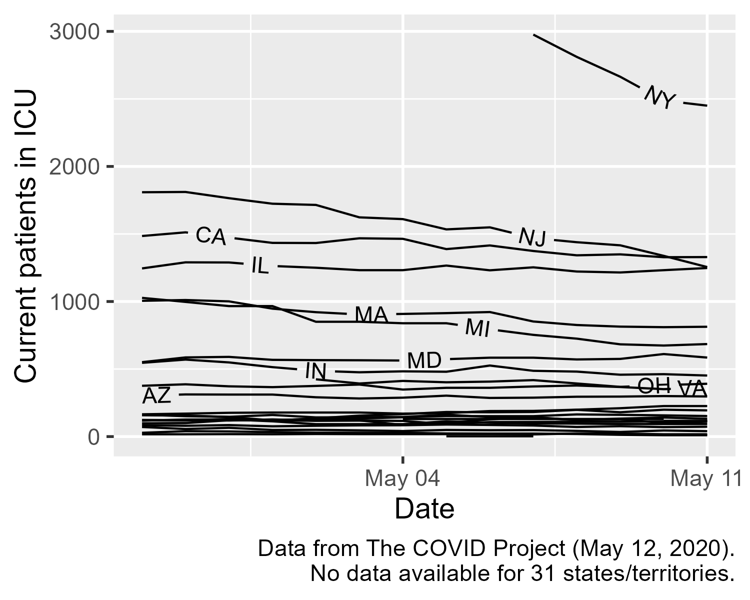
And then we can put the linear regression “smooth” on it. 🙃
Update: Notes from the Tracking Project trenches [Mar. 24, 2022]
After releasing this post, COVID Tracking Project alum Quang Nguyen shared some behind the scenes details of what happened around May 7th, 2020. I will repost the Twitter thread here:
OMG @COVID19Tracking history lesson (short 🧵)!! First, shoutout to our data infrastructure folks @zachlipton @JuliaKodysh for the GitHub archive! Second, I actually dug through the slack to figure out what happened (jokes on me, I was shift lead that day). https://t.co/7U6LOm8HKE pic.twitter.com/iXdPO9EV6A
— Quang Nguyen (@quangpmnguyen) March 24, 2022
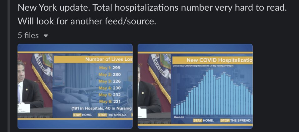
The problem was, back in May 2020, the only way you can get hospitalization data for the state of NY was to take low-res screenshots of the governor's presentation and then try to piece the information together (also shoutout to @justinhendrix for watching these press conf.). pic.twitter.com/5UnGP1RUox
— Quang Nguyen (@quangpmnguyen) March 24, 2022
Using this weird graph, we actually tried to back-calculate total hospitalization numbers, but unfortunately, it was super messy and nothing came out of it. This source also doesn't have current ICU numbers.
— Quang Nguyen (@quangpmnguyen) March 24, 2022
We actually found a new source from Twitter (!!) who apparently got these numbers from a press email list from the governor (??). May 7th was the first day where we got data directly from the email list, which was the BLIP in total ICU data that made it onto the disastrous graph.
— Quang Nguyen (@quangpmnguyen) March 24, 2022
The bottom line is: data from 2020 was a mess, and don't trust anything that came out of it. A group of volunteers taped it together using nothing but hot glue and scotch tape.
— Quang Nguyen (@quangpmnguyen) March 24, 2022
The fact they had to pull numbers from the graphs in the Governor’s Covid briefings is an important reminder that high-quality Covid-19 was hard to come by at the start of the pandemic (especially from the Cuomo administration). We needed something like the COVID Tracking Project where volunteers would go to heroic lengths to curate data.
Last knitted on 2022-05-27. Source code on GitHub.1
-
.session_info
#> ─ Session info ───────────────────────────────────────────────────────────────
#>  setting  value
#>  version  R version 4.2.0 (2022-04-22 ucrt)
#>  os       Windows 10 x64 (build 22000)
#>  system   x86_64, mingw32
#>  ui       RTerm
#>  language (EN)
#>  collate  English_United States.utf8
#>  ctype    English_United States.utf8
#>  tz       America/Chicago
#>  date     2022-05-27
#>  pandoc   NA
#>
#> ─ Packages ───────────────────────────────────────────────────────────────────
#>  package      * version date (UTC) lib source
#>  assertthat     0.2.1   2019-03-21 [1] CRAN (R 4.2.0)
#>  backports      1.4.1   2021-12-13 [1] CRAN (R 4.2.0)
#>  bit            4.0.4   2020-08-04 [1] CRAN (R 4.2.0)
#>  bit64          4.0.5   2020-08-30 [1] CRAN (R 4.2.0)
#>  broom          0.8.0   2022-04-13 [1] CRAN (R 4.2.0)
#>  cachem         1.0.6   2021-08-19 [1] CRAN (R 4.2.0)
#>  cellranger     1.1.0   2016-07-27 [1] CRAN (R 4.2.0)
#>  cli            3.3.0   2022-04-25 [1] CRAN (R 4.2.0)
#>  colorspace     2.0-3   2022-02-21 [1] CRAN (R 4.2.0)
#>  crayon         1.5.1   2022-03-26 [1] CRAN (R 4.2.0)
#>  curl           4.3.2   2021-06-23 [1] CRAN (R 4.2.0)
#>  DBI            1.1.2   2021-12-20 [1] CRAN (R 4.2.0)
#>  dbplyr         2.1.1   2021-04-06 [1] CRAN (R 4.2.0)
#>  digest         0.6.29  2021-12-01 [1] CRAN (R 4.2.0)
#>  downlit        0.4.0   2021-10-29 [1] CRAN (R 4.2.0)
#>  dplyr        * 1.0.9   2022-04-28 [1] CRAN (R 4.2.0)
#>  ellipsis       0.3.2   2021-04-29 [1] CRAN (R 4.2.0)
#>  evaluate       0.15    2022-02-18 [1] CRAN (R 4.2.0)
#>  fansi          1.0.3   2022-03-24 [1] CRAN (R 4.2.0)
#>  farver         2.1.0   2021-02-28 [1] CRAN (R 4.2.0)
#>  fastmap        1.1.0   2021-01-25 [1] CRAN (R 4.2.0)
#>  forcats      * 0.5.1   2021-01-27 [1] CRAN (R 4.2.0)
#>  fs             1.5.2   2021-12-08 [1] CRAN (R 4.2.0)
#>  generics       0.1.2   2022-01-31 [1] CRAN (R 4.2.0)
#>  geomtextpath   0.1.0   2022-01-24 [1] CRAN (R 4.2.0)
#>  ggplot2      * 3.3.6   2022-05-03 [1] CRAN (R 4.2.0)
#>  git2r          0.30.1  2022-03-16 [1] CRAN (R 4.2.0)
#>  glue           1.6.2   2022-02-24 [1] CRAN (R 4.2.0)
#>  gtable         0.3.0   2019-03-25 [1] CRAN (R 4.2.0)
#>  haven          2.5.0   2022-04-15 [1] CRAN (R 4.2.0)
#>  here           1.0.1   2020-12-13 [1] CRAN (R 4.2.0)
#>  highr          0.9     2021-04-16 [1] CRAN (R 4.2.0)
#>  hms            1.1.1   2021-09-26 [1] CRAN (R 4.2.0)
#>  httr           1.4.3   2022-05-04 [1] CRAN (R 4.2.0)
#>  jsonlite       1.8.0   2022-02-22 [1] CRAN (R 4.2.0)
#>  knitr        * 1.39    2022-04-26 [1] CRAN (R 4.2.0)
#>  labeling       0.4.2   2020-10-20 [1] CRAN (R 4.2.0)
#>  lifecycle      1.0.1   2021-09-24 [1] CRAN (R 4.2.0)
#>  lubridate      1.8.0   2021-10-07 [1] CRAN (R 4.2.0)
#>  magrittr       2.0.3   2022-03-30 [1] CRAN (R 4.2.0)
#>  memoise        2.0.1   2021-11-26 [1] CRAN (R 4.2.0)
#>  modelr         0.1.8   2020-05-19 [1] CRAN (R 4.2.0)
#>  munsell        0.5.0   2018-06-12 [1] CRAN (R 4.2.0)
#>  pillar         1.7.0   2022-02-01 [1] CRAN (R 4.2.0)
#>  pkgconfig      2.0.3   2019-09-22 [1] CRAN (R 4.2.0)
#>  purrr        * 0.3.4   2020-04-17 [1] CRAN (R 4.2.0)
#>  R6             2.5.1   2021-08-19 [1] CRAN (R 4.2.0)
#>  ragg           1.2.2   2022-02-21 [1] CRAN (R 4.2.0)
#>  readr        * 2.1.2   2022-01-30 [1] CRAN (R 4.2.0)
#>  readxl         1.4.0   2022-03-28 [1] CRAN (R 4.2.0)
#>  reprex         2.0.1   2021-08-05 [1] CRAN (R 4.2.0)
#>  rlang          1.0.2   2022-03-04 [1] CRAN (R 4.2.0)
#>  rprojroot      2.0.3   2022-04-02 [1] CRAN (R 4.2.0)
#>  rstudioapi     0.13    2020-11-12 [1] CRAN (R 4.2.0)
#>  rvest          1.0.2   2021-10-16 [1] CRAN (R 4.2.0)
#>  scales         1.2.0   2022-04-13 [1] CRAN (R 4.2.0)
#>  sessioninfo    1.2.2   2021-12-06 [1] CRAN (R 4.2.0)
#>  stringi        1.7.6   2021-11-29 [1] CRAN (R 4.2.0)
#>  stringr      * 1.4.0   2019-02-10 [1] CRAN (R 4.2.0)
#>  systemfonts    1.0.4   2022-02-11 [1] CRAN (R 4.2.0)
#>  textshaping    0.3.6   2021-10-13 [1] CRAN (R 4.2.0)
#>  tibble       * 3.1.7   2022-05-03 [1] CRAN (R 4.2.0)
#>  tidyr        * 1.2.0   2022-02-01 [1] CRAN (R 4.2.0)
#>  tidyselect     1.1.2   2022-02-21 [1] CRAN (R 4.2.0)
#>  tidyverse    * 1.3.1   2021-04-15 [1] CRAN (R 4.2.0)
#>  tzdb           0.3.0   2022-03-28 [1] CRAN (R 4.2.0)
#>  utf8           1.2.2   2021-07-24 [1] CRAN (R 4.2.0)
#>  vctrs          0.4.1   2022-04-13 [1] CRAN (R 4.2.0)
#>  vroom          1.5.7   2021-11-30 [1] CRAN (R 4.2.0)
#>  withr          2.5.0   2022-03-03 [1] CRAN (R 4.2.0)
#>  xfun           0.31    2022-05-10 [1] CRAN (R 4.2.0)
#>  xml2           1.3.3   2021-11-30 [1] CRAN (R 4.2.0)
#>
#>  [1] C:/Users/Tristan/AppData/Local/R/win-library/4.2
#>  [2] C:/Program Files/R/R-4.2.0/library
#>
#> ──────────────────────────────────────────────────────────────────────────────

Leave a comment